 Wilbert Baan
Quantifying user experiences
This image is from the latest deck of Benedict Evans. Each year he gives an overview of macro trends and it never disappoints. Make sure to follow his newsletter or twitter.
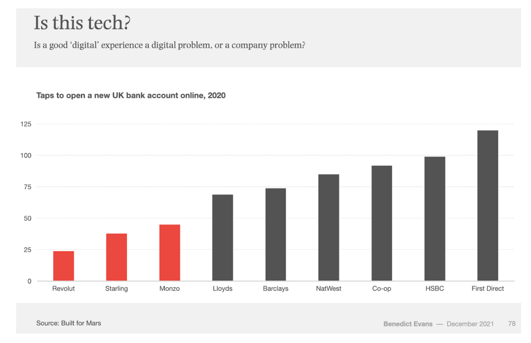
In this year’s deck there is a slide about the digital experiences in the banking industry. It’s fascinating to see that you can quantify in a chart how ‘tech-savvy’ companies are by just counting clicks.
Counting and observing is a method of quantifying user experiences that doesn’t get the attention it deserves. It’s a very basic way to compare between different companies. Create a spreadsheet and just start writing down what you see.
How many clicks does something take. How many seconds does something take. What are the features of company A, what are the features of company B. What is the pricing setup. What is the information I get per step in the funnel.
Doing this exercise will help you see where you over or under perform compared to competitors. And where you can have the biggest impact by adding or removing something.
It’s a good method to make clear what you often already know, but is difficult to articulate.
In this image, what makes Revolut or Monzo different form Barclays or HSBC? They care more about simplifying the onboarding process as they probably care more about getting new customers.
Image from Benedict Evans presentation 2021